UX Research and Writing Case Study: Circle In
An overview: Circle In offers a content-based SaaS platform that guides working parents through different stages of their parenthood journey. From the time you are planning or expecting to the time you go on leave and return to work, their platform houses articles, resources and guides to help parents navigate the juggle.
The problem: We had over 250 pieces of content across five journey stages. User behaviour suggested that subscribers were merely dipping in and out of the platform to consume articles, which means they missed key features or pools of content. This also makes users perceive Circle In as an editorial/ publishing entity vs a must-have program during all stages of their parenthood journey.
The solution: Using a design sprint-inspired process, we wished to change the content delivery from an editorial style to a more program based style to keep users coming back to the platform. We also changed the content formats to be more snackable and interactive to increase platform engagement.
My role: Content strategist, UX researcher and UX writer. I supported the UX lead in conducting user interviews, mapped the customer journey and plotted existing content against it, and re-framed our content to fit our new program.
*****
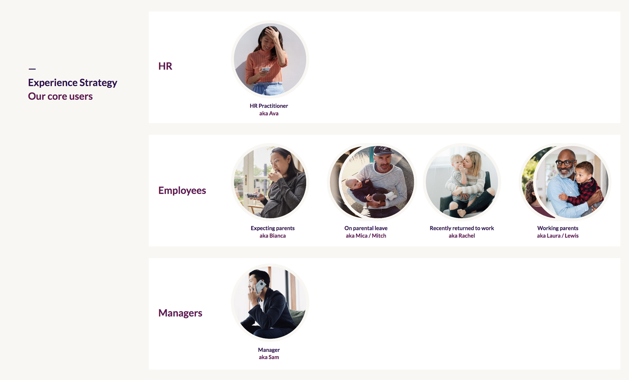
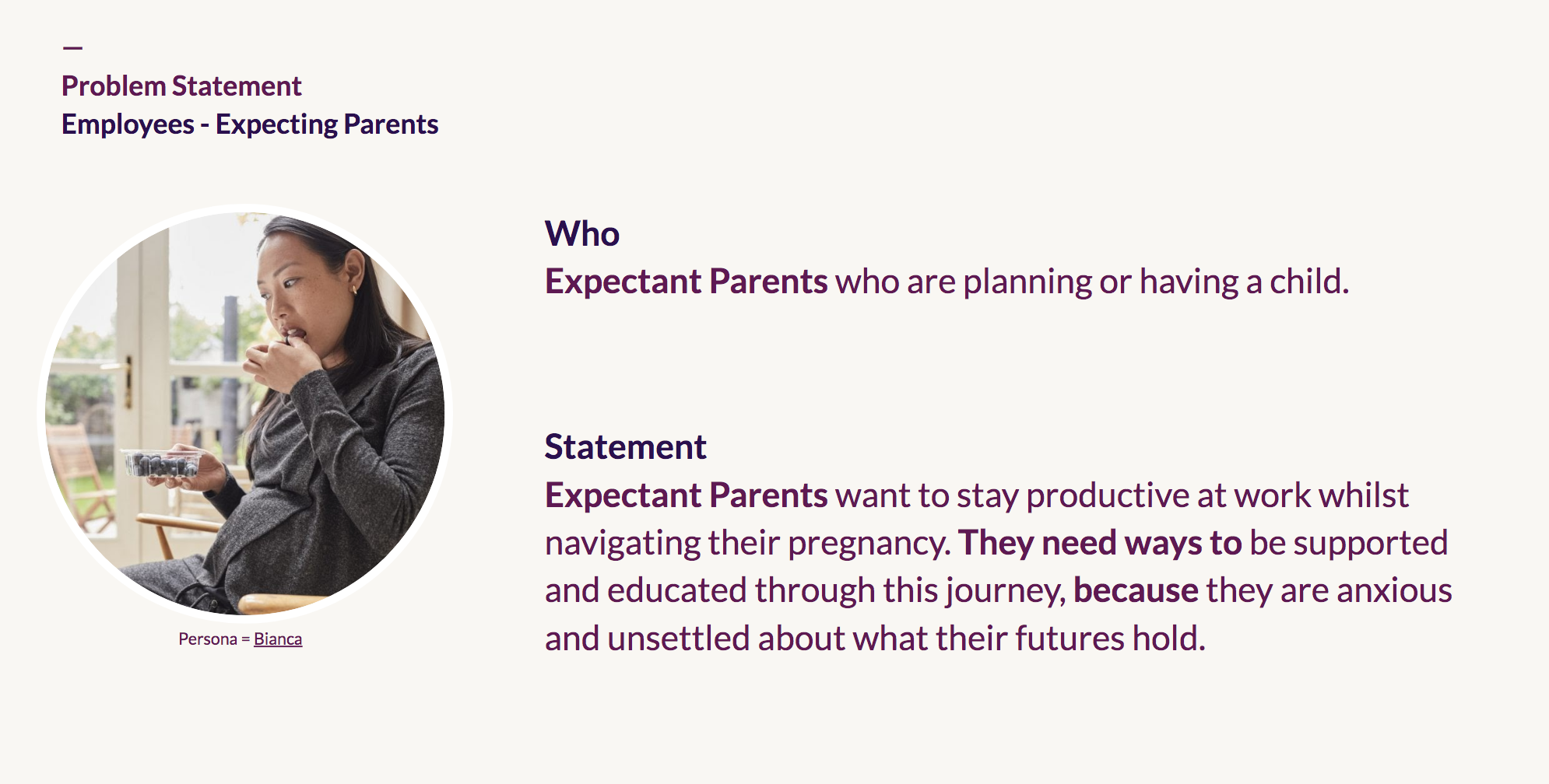
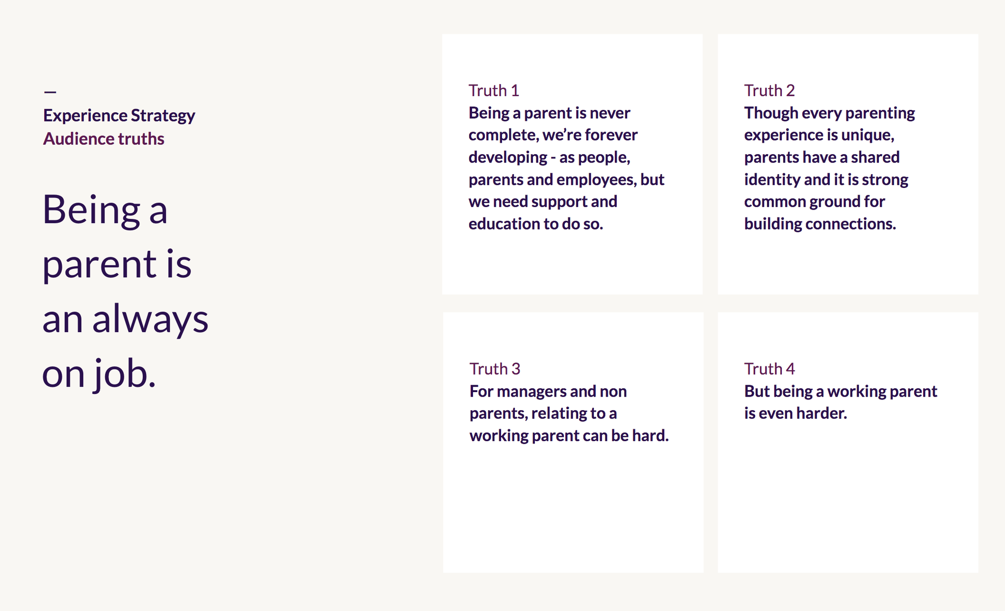
User research
Understanding customer truths through in-depth interviews.
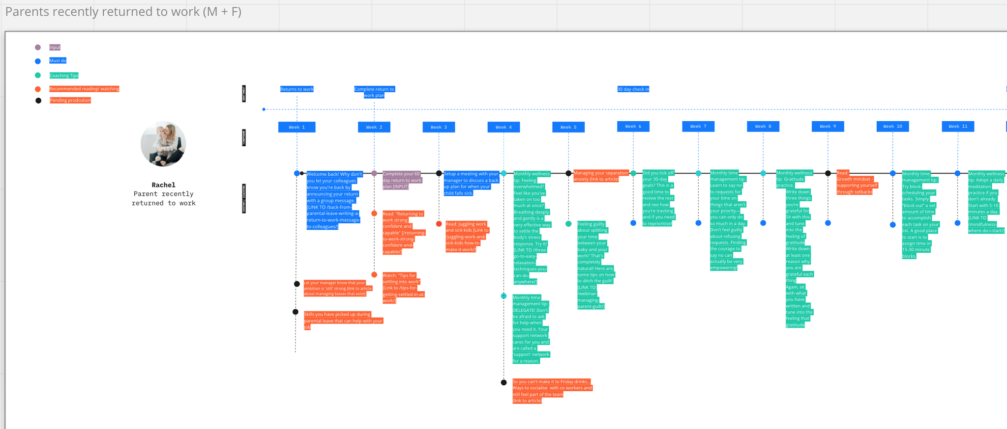
Customer journey mapping
Breaking down the parenthood journey by weeks, themes and pain points to map relevant content to serve at the right time.
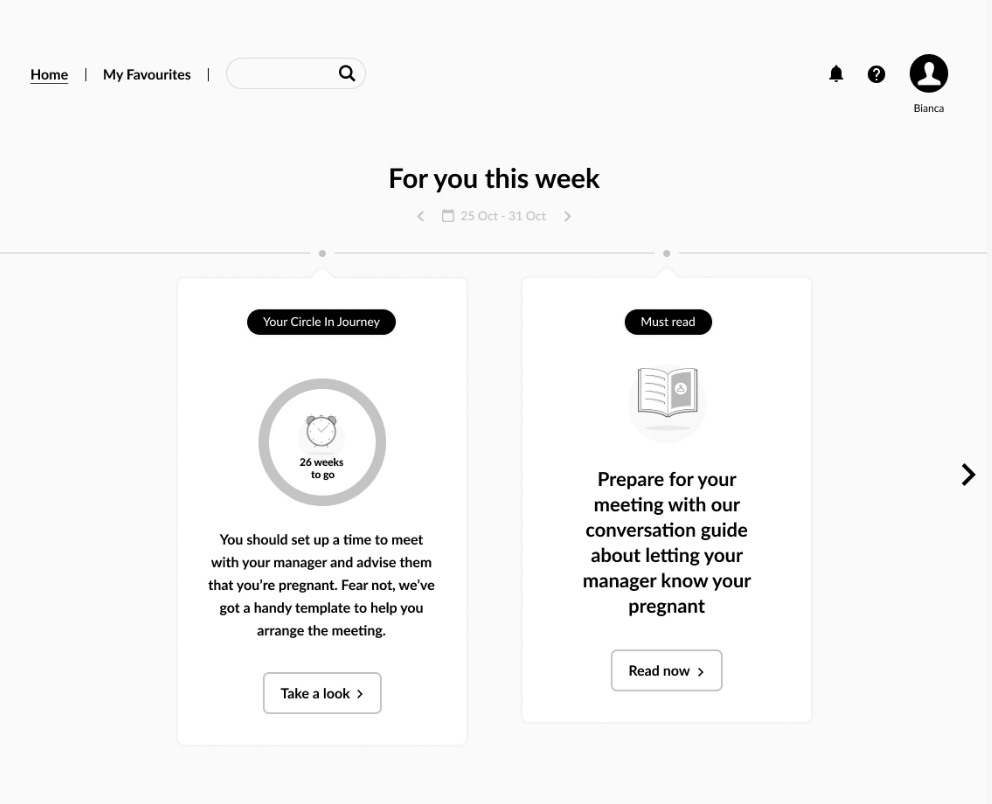
Final designs (mock ups)*
The final output was a structured program delivered via cards. Design rationale is based on the insight that users are time-poor and drowning in content from other feeds (socials, news, messaging apps etc). Therefore know it is important not to overwhelm them and add to their stress. So, instead, harnessing conversational microlearning to deliver bite-size tips, recommendations and actions to handhold them and coach them through their journey. Content needed to be re-written from an editorial long-form format to bite-sized cards with checklists, buttons and input fields.
The new formats were tested with subscribers for engagement, utility and tone of voice.
*Unable to share the 'before' screenshots due to confidentiality.
Key Takeaways
This project taught me the importance of versatility in content formats. Through this exercise, I learned how to functionally collaborate with UX designers and tech experts. This project also put my user testing skills to the test!
